When considering a website or mobile app, a UI button Design is one of the smallest yet most powerful aspects you will experience. Buttons are everywhere, from a "sign up" CTA to your "Cart" button in ecommerce apps on your home page. The small rectangles (or circles, or pellet-shaped designs) are very helpful in guiding customers as they navigate through their experience.
However, that said, not all buttons are created equally. A poorly-designed button can confuse customers, stifle conversions, and make your online experience unprofessional. But a well-designed button can increase clarity, access, and trust. This is why the design of the UI button deserves to be considered.
In this guide, we will cover best practices of principles, types, anatomy, CSS examples, and UI button design, and provide you with tips and resources you can use right away.
Core Principles of Effective UI Button Design
Before addressing type and style, it is important to discuss the principles behind good buttons.
-
Clarity is king: Your button should provide your desired action immediately. An ambiguous label like "submit" might be okay with some forms, but "download report" or "book a demo" is very strong/action-oriented.
-
Stability creates trust: Have similar button styles across your website or app. If your CTA button is green on one page and blue on another, there is a possibility of hesitation. Consistency encourages recognition.
-
Feedback is important: The button should give feedback; a hover effect, a change in color, or even an obscure shade can provide assurance to the user that their action has been recognized.
-
Accessibility is non-negotiable: Ensure your button has enough color contrast, legible text, and is keyboard navigable. Not everyone uses a mouse or touch screen the same way.
-
10 Commandments (inspired by Justinmind): make the buttons click, make sure they use legible text, use legible text, give the buttons an appropriate size to touch, and avoid overwhelming the user with too many options.
A Deep Dive into Types of UI Buttons
Buttons come in many forms, and choosing the right one depends on hierarchy and context.
Action-Based Types
-
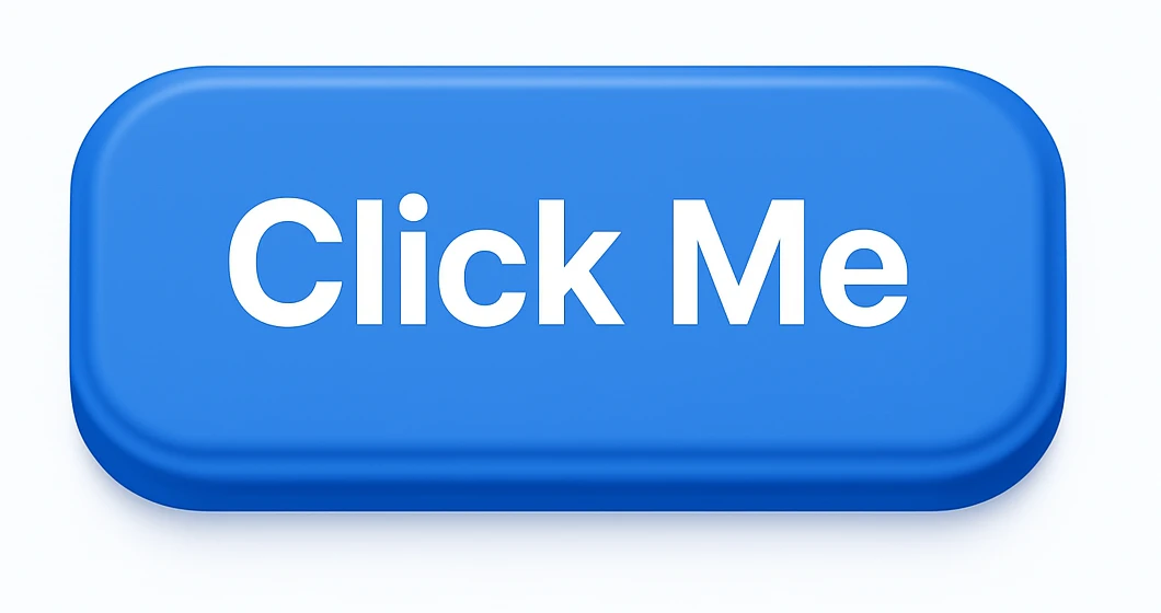
Primary/CTA Buttons: These are the stars of the show. Think “Buy Now” or “Sign Up.” They’re bold, usually in a high-contrast color, and appear only once per screen to avoid confusion.
-
Secondary Buttons: Still important, but less dominant. They often use a neutral color or outline. Example: “Learn More.”
-
Ghost/Outlined Buttons: Transparent with a border. These are perfect when you want a clean look without pulling too much attention.
Visual-Based Types
-
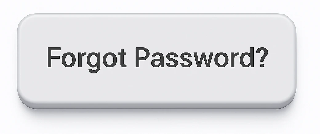
Text Buttons: Simple, no borders, just clickable text. Great for actions like “Forgot Password?”
-
Icon-Only Buttons: Think of the hamburger menu icon or a heart icon for “like.” They save space but require universally recognizable symbols.
-
Toggle Buttons: Used to switch between two states, like on/off or grid/list view.
The Anatomy of a Perfect Button
A button is not merely a shape with text. Every detail is essential.
-
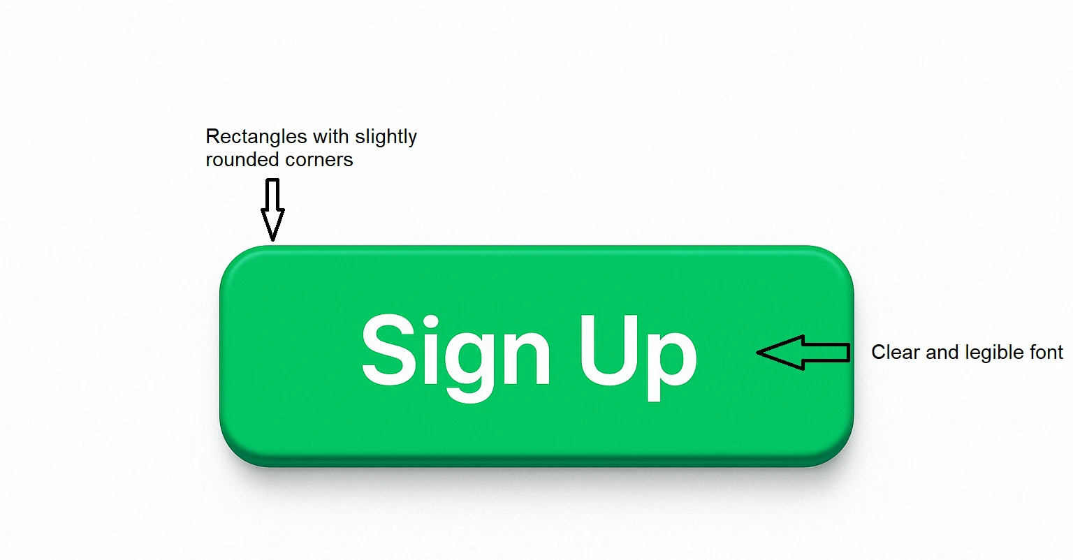
Shape & Size: Rectangles with slightly rounded corners are the most common, but pill-shaped buttons are common in modern UI. Make sure they are large enough for fingers to tap (44x44px at minimum for mobile).
-
Color & Contrast: Color shows hierarchy. A bright green call to action (CTA) will float above a muted background. Ensure that it meets contrast standards on the accessibility checklist in your design system.
-
Typography: Choose a clear and legible font. Use as few words as possible, ideally one to three bold phrases. Keep lettering simple and legible.
-
Space & Padding: Give text margins. Buttons that have cramped copy look and feel bad and create friction between users and products.
Designing and Styling Buttons with CSS
Design theory is one thing, but let’s talk about code. CSS makes buttons come alive.
A Basic UI Button Style
|
button {
background-color: #007BFF;
color: #fff;
padding: 12px 20px;
border: none;
border-radius: 6px;
cursor: pointer;
font-size: 16px;
}
|
Adding States (Hover, Active, Disabled)
|
button:hover {
background-color: #0056b3;
}
button:active {
background-color: #004080;
}
button:disabled {
background-color: #ccc;
cursor: not-allowed;
}
|
Advanced Example: Gradient Button
|
button {
background: linear-gradient(90deg, #ff7e5f, #feb47b);
color: white;
padding: 14px 28px;
border: none;
border-radius: 50px;
font-weight: bold;
transition: 0.3s;
}
button:hover {
opacity: 0.9;
}
|
These simple snippets can be copied, tweaked, and tested in your projects right away.
Popular UI Button Design Tools and Resources
If you’re designing UI buttons beyond just code, here are some go-to tools:
-
Figma: Create reusable button components and test different states easily.
-
Sketch: A great tool for Mac-based designers who want scalable UI kits.
-
Adobe XD: Perfect for prototyping buttons within complete workflows.
-
Free Resources: Websites like ui-buttons.web.app offers free, ready-to-use button collections.
Best Practices and Common Pitfalls of UI Button Designs
We'd like to conclude by going over some do’s and don'ts that differentiate amateur buttons from professional buttons.
Do's:
-
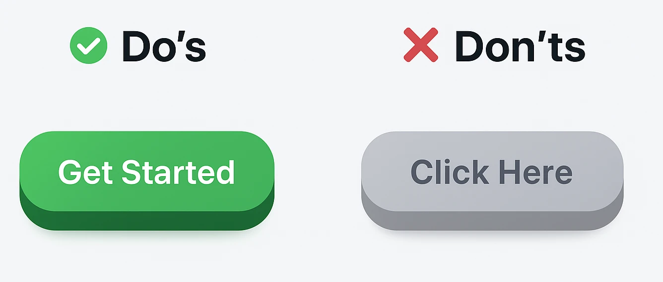
Use short, active labels (e.g., "Get Started").
-
Add enough padding to create some comfort.
-
Make sure to test buttons on multiple devices (mobile, desktop, tablet).
Don'ts:
-
Never use more than one primary CTA on a screen; it dilutes the attention.
-
Never use vague labels like "Click Here."
-
Never choose low contrast color options; this can frustrate users and create accessibility issues.
Conclusion
Although it appears to be modest, a UI Button Designs is often the bridge between what users intend to do and what you want to do for them in the UI/UX realm. A purposeful button design increases the purpose, access, and conversion. Whether you are coding with CSS, designing in Figma, or adjusting your styles on a website, you should always think about clarity, stability, and access when designing the button.
To be clear, in Rasonix, we do not design stunning interfaces; We create digital experiences suited to conversion. If you are after the pixel or UI design and the button under a system that is comfortable for your upcoming website or app, controller, or system, then we can help. Let's talk about your project.
FAQs
1. What is UI button design?
UI button design is the act of designing a clickable object (a button) on a webpage or application to prompt users to take action, such as “Sign Up,” “Buy,” or “Download.” Good design makes buttons apparent, accessible, and easy to interact with.
2. What are the main types of UI buttons?
The most common button types include:
-
Primary (CTA) buttons for the main action.
-
Secondary buttons for supportive actions.
-
Ghost/Outlined buttons for less emphasis.
-
Text buttons, icon-only buttons, and toggle buttons for specific scenarios.
3. How do I design a button for accessibility?
To design accessible buttons:
-
Ensure strong color contrast between buttons and backgrounds.
-
Use a descriptive text label instead of vague people.
-
Make them big enough for touch (minimum 44x44px).
-
Enable keyboard navigation for users that cannot use the mouse.
4. What is the difference between primary and secondary buttons?
A primary button highlights the most important action on a screen (eg, "checkout"). It usually stands out with a bold color.
A secondary button supports alternative actions (eg, "later saved") and styled with less vigor, often using neutral tones or outline.
5. In what ways can I style buttons in CSS?
CSS allows for styling of button colors, size, borders, and hover states. For example:
|
button {
background-color: #007BFF;
color: #fff;
padding: 12px 20px;
border-radius: 6px;
}
|
Adding :hover, :active, and :disabled states can facilitate interaction feedback to the user.
6. What tools can I use to design UI buttons with?
Figma, Sketch, and Adobe XD are all popular tools for prototyping and building reusable button components. Further, there are free UI button kits and examples from websites such as ui-buttons.web.app, which can expedite your design work.
7. What are common mistakes to avoid when designing buttons?
-
Too many primary buttons on a screen
-
Writing vague buttons like "Click Here"
-
Using colors with little contrast
-
Making buttons small for a touchscreen
8. How can I test if a button design is successful?
Button testing can be done via A/B testing, usability testing, and heatmaps. Test various colors, text, and placement to identify designs that incite a higher percentage of engagement or conversion.